Product. Mobile application
My role. Product Lead
Market. Europe
Transforming complex nutrition data into healthy behaviors
The idea from the Nutriapp comes from a business opportunity. Barmer - a healthcare company, and Telekom - a telecommunications enterprise, acquired a databank containing detailed nutrition data from thousand of aliments. The project challenge was to transform this asset into a commercial product, increasing the service experience from those brands.
The project context
APPROACH
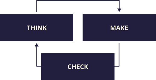
In this project, I employed the Lean UX approach. The core purpose is to get feedback as early as possible on product development so we can create quick wins. It is designed for Agile development, producing new relevant data on each iterative cycle.
MAIN GOALS
1.Guarantee a good data protection policy
2.Create a new user behaviour
3.Design a dynamic environment for specialists and patients
4.Translate complex data into accessible information
HYPOTHESIS
To guarantee a healthy lifestyle, we need to consume a specific combination and dose of micronutrients. If you are not a nutrition professional, creating a balanced diet by yourself could be very difficult. The App emerges in this context. For this, I intended to create the most accurate nutrition track system on the market and combine it with a collaborative environment for nutrition professionals and patients.
We facilitate people's access to nutritional information and medical support.
Think
START WITH WHY
In order to create a successful product, I began this project by asking the question: why? This was an essential step before I jumped into developing solutions without thinking about the real problems and associated project risks.
Some of the questions I asked myself were:
-
- Why is this project even being done?
- What outcome are we trying to achieve with this project?
- What does success look like?
- Is it okay for users to share information about their nutrition habits with their health insurance company or employer?
- How can we mitigate this risk?
SETTING GOALS AND SUCCESS METRICS
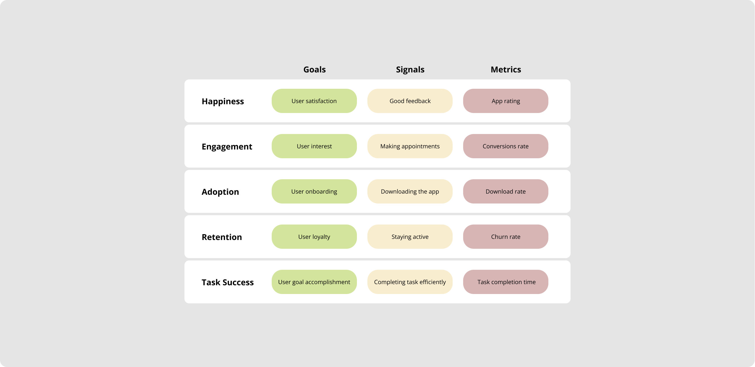
When a goal is in place, everything flows beautifully, even though the path to get there may change. I needed to establish some metrics measures to help my team make accurate decisions in the product development process.
I decided to use the HEART framework. This method involves user-centered metrics that allow you to measure the user experience on a large scale, having the business funnel as a base.
INTERVIEWS
The project discovery phase included specialists and potential final user interviews.It permitted me to understand the micronutrients role in our health and learn how to improve the relationship between nutritionists and their patients.
COMPETITOR ANALYSIS
Through a competitor analysis was possible to realise how the micronutrients databank was a valuable asset. At the time, all other market players could only provide nutrition trackers on the macro level.
I also discovered that most diet apps have storytelling based on losing weight or muscle gain. So, it was easy to construct our product narrative around a healthy lifestyle, differentiating our branding from the competitors.
MAPPING PAIN POINTS
We also used UX techniques such as user journey and personas to identify possible pain points and help us to create hypothesis for our MVP.
Make
USER STORIES
I started this project phase by writing down user stories. Those are general explanations of a software feature written from the end user's perspective. It works as a guideline for the designers to create a UX around a feature and later to help the developers understand the spec's general context.
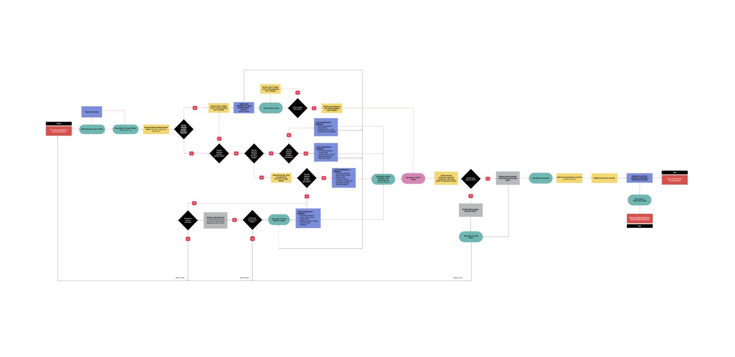
USER FLOWS
Then I create user flows. By mapping out the various steps a user takes, I could identify opportunities to improve the product's usability, identify areas of friction or confusion, and create a more streamlined and intuitive experience for users.
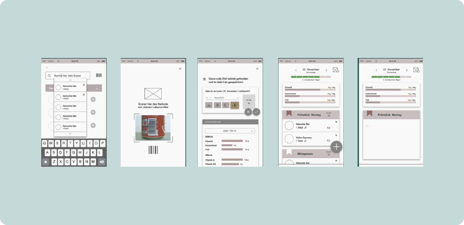
WIREFRAMES
I also assembled wireframes to provide a clear and simple representation of the product's UI so that designers and stakeholders could quickly explore solutions and evaluate and make changes to the overall layout and flow.
DESIGN SYSTEM
Design systems are vital to creating consistency and good usability. In partnership with the Barmen visual design team, I used the company brand guidelines as the base for our mobile application.
Then, I began to specify the most critical components based on content needs, prioritising and simplifying them to meet our agile sprints' product development timelines and assembling everything in an Atomic design library.
PROJECT SPECS
I also create project documentation to communicate the requirements to the engineering team and support our QA tester unit in writing accurate cases. It included not only the standard CX specs but also animation and timing keyframes for the micro-interactions.
Outcomes
BUSINESS OUTCOMES
4.3
Reviews star rating
156K
Downloads
33k
Medical appointments
DESIGN OUTCOMES
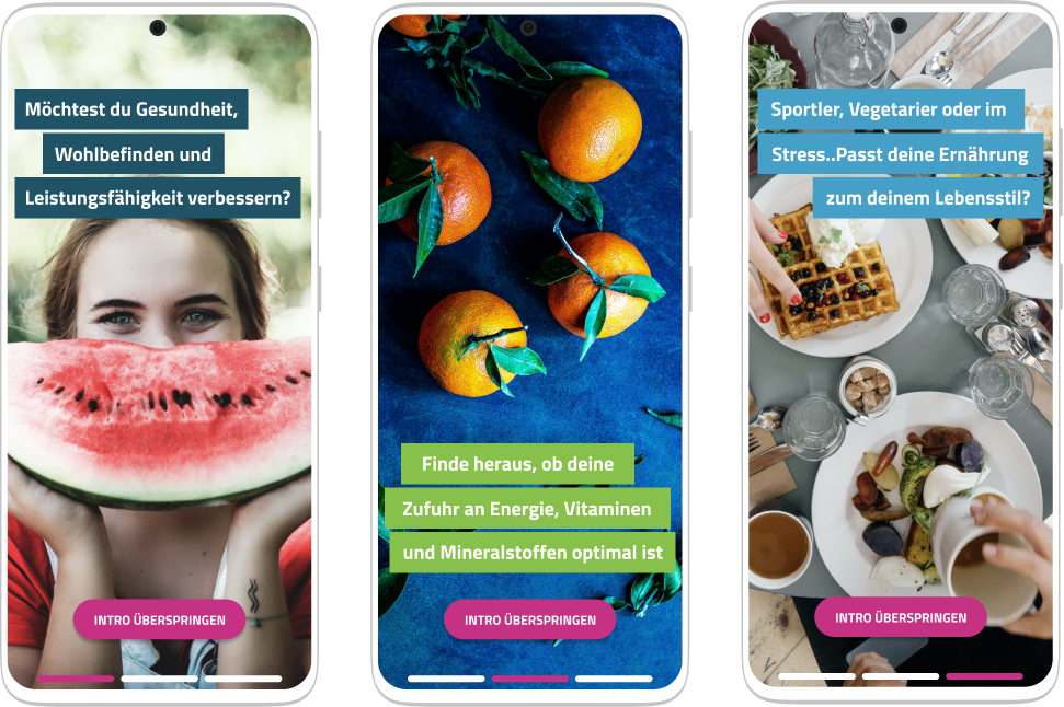
LIFESTYLE ON FOCUS
We decided to create the Nutriapp based on different lifestyles.
In cooperation with specialists, we defined eight main types of nutrition groups. Each one of these targets has a particular demand for micronutrients.
Take as an example people who smoke cigarettes. Their necessity for Vitamin C is higher than other persons. Or perhaps you are pregnant. You need then to consume more folic acid.

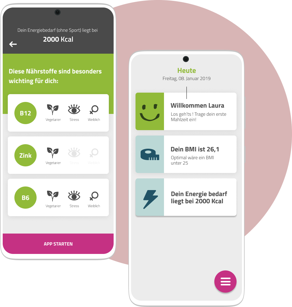
TRANSFORMING COMPLEX DATA INTO MEANINGFUL INSIGHTS
One thing is inevitable in the nutrition analyses world: We need data! Age, gender, weight, what you ate, what sports you do,...
Providing so much information could be discouraging, especially if you do not understand why!
To deal with this challenge, we defined some cornerstones of your project. Ever data shared on the app must result in an expressive insight.
For instance: Do you give us your height and weight? Let's immediately give your BMI and tell you if you are at your ideal weight.
RECOGNISING PATTERNS TO IMPROVE USABILITY
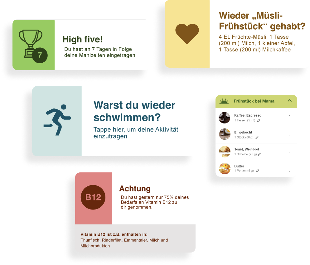
Everybody follows patterns in our day-to-day actions, and It is terrific! Nutriapp automatically identifies these behaviours and uses them to create short-cuts improving app usability.
Are you still going every Friday to kickboxing classes and eating a large coffee cup every morning? Our app automatically recognises it. There is no need for you to provide this info over and over again.
CREATING DETAILED MICRONUTRITION REPORTS
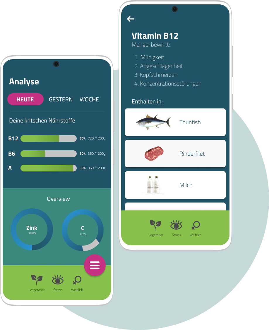
Different from the competitors, Nutriapp provides complete analyses of your micronutrient consumption. You can overview the essential vitamins and minerals for you, access full nutrition reports, receive alerts in your feed. At the same time, you can better understand the role of those nutrients in your body and receive tips about each kind of food you need to consume more.
SPECIALISTS AND PATIENTS WORKING TOGETHER
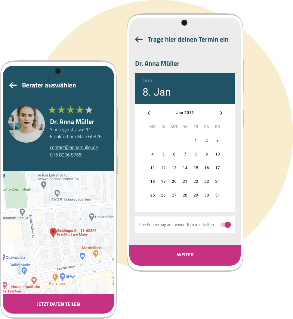
To bring more value to the BARMER healthcare services, we connect nutrition specialists with patients direct on Nutriapp. We redesign and integrate the experience of receiving professional support in only one place. On the app, it is possible to find a nutritionist near you, make an appointment, share your data and nutrition reports, receive diets directly, display results of laborious exams, and much more.


Leave a Reply